The Human Side of Data
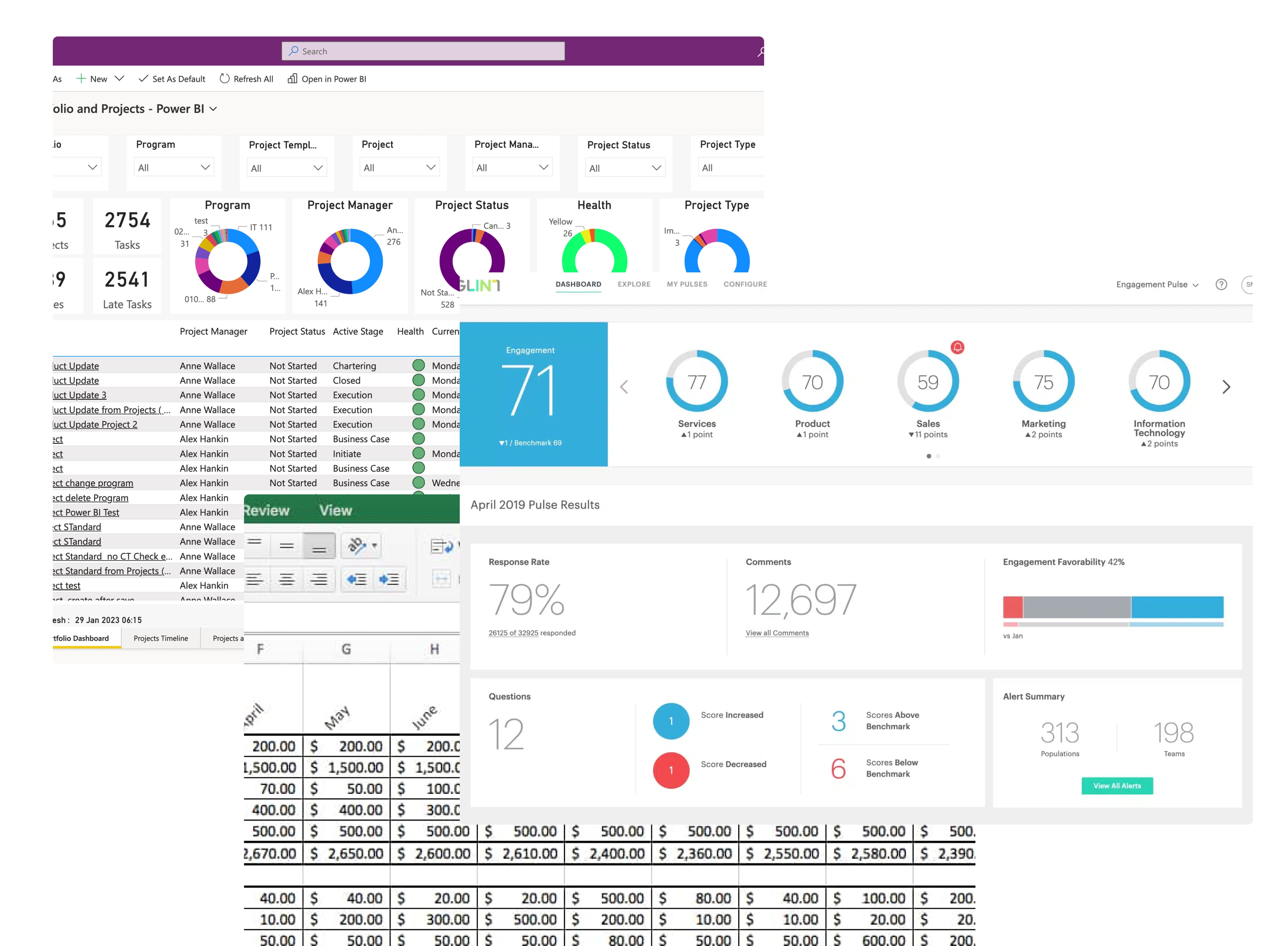
Large organizations share a common challenge: effectively understanding and tracking employee sentiment. The People Experience team needed to revolutionize how they process biannual employee surveys. Beyond traditional data collection, forms were the foundation of our innovation processes. For analysts, these surveys represented the critical touchpoint where employee sentiment transformed into actionable insights. Yet, the tools they used fragmented this vital information across multiple platforms.
Our mission became clear: create a data visualization tool that transforms complex employee data into actionable intelligence.
Walking in Data Analysts' Shoes
Working with data analysts revealed a fractured workflow: constant context-switching between dashboards, spreadsheets, and presentations. Each transition risked losing valuable insights in translation. More critically, this fragmentation created isolated data silos, preventing the discovery of deeper correlations and patterns that could illuminate the full employee experience story.
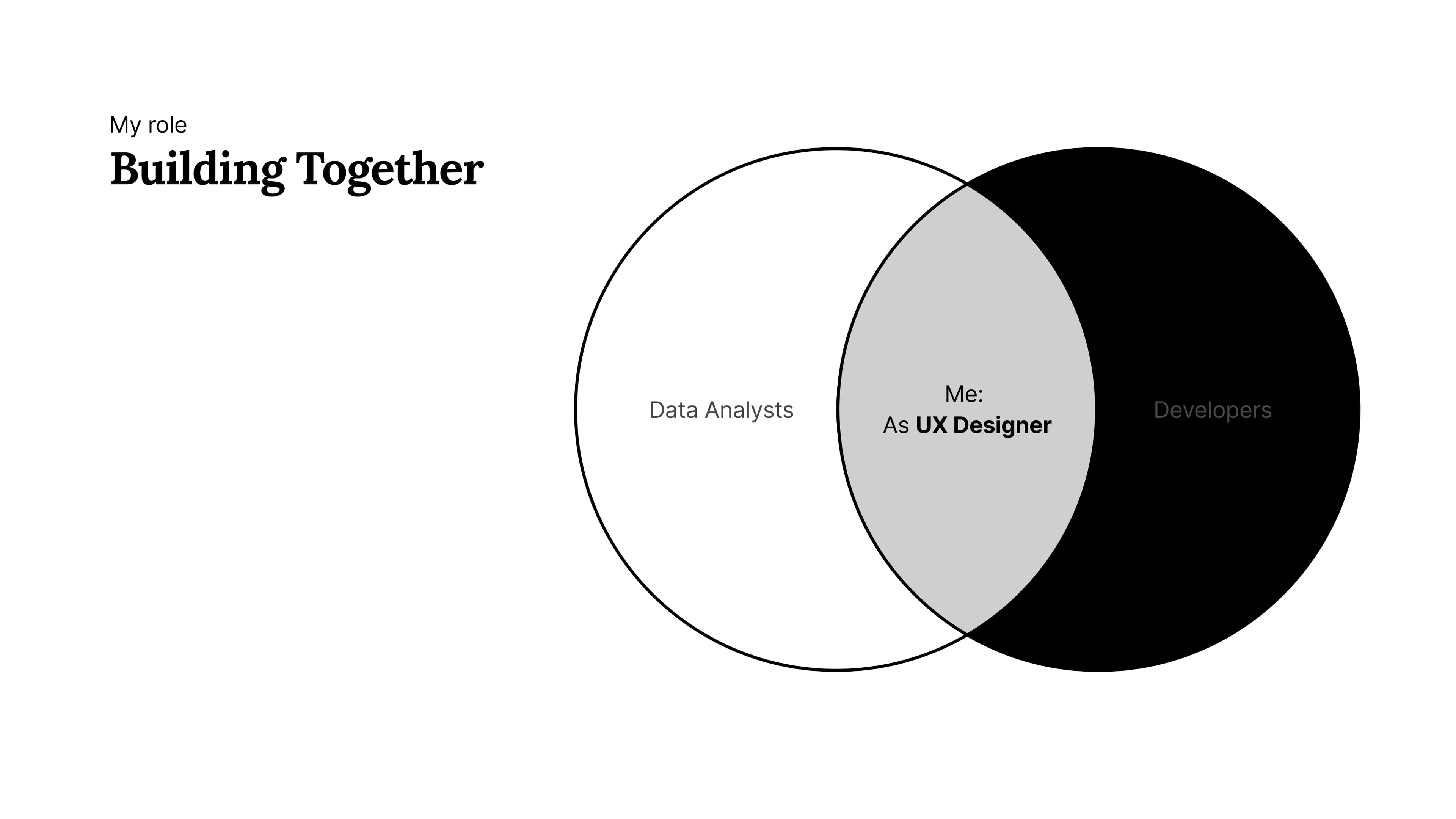
The highly technical background of our team sparked a shift in our research approach. Instead of traditional methods, we embraced collaborative design, making data analysts active participants in shaping the solution. My role evolved into a strategic facilitator - asking probing questions, understanding underlying intentions, and translating technical requirements into user experience concepts. I also took charge of prioritizing efforts and establishing our development sequence, ensuring we tackled the most impactful features first.
The development team's early involvement created a powerful dynamic - while they experimented with data models, analysts provided immediate feedback. This real-time loop enabled constant validation and adjustment, breaking away from linear research-then-build processes.
From Pain Points to Possibilities
What started as a tool integration challenge evolved into something more fundamental: how might we enable analysts to transform raw data into meaningful narratives about our people's journey?
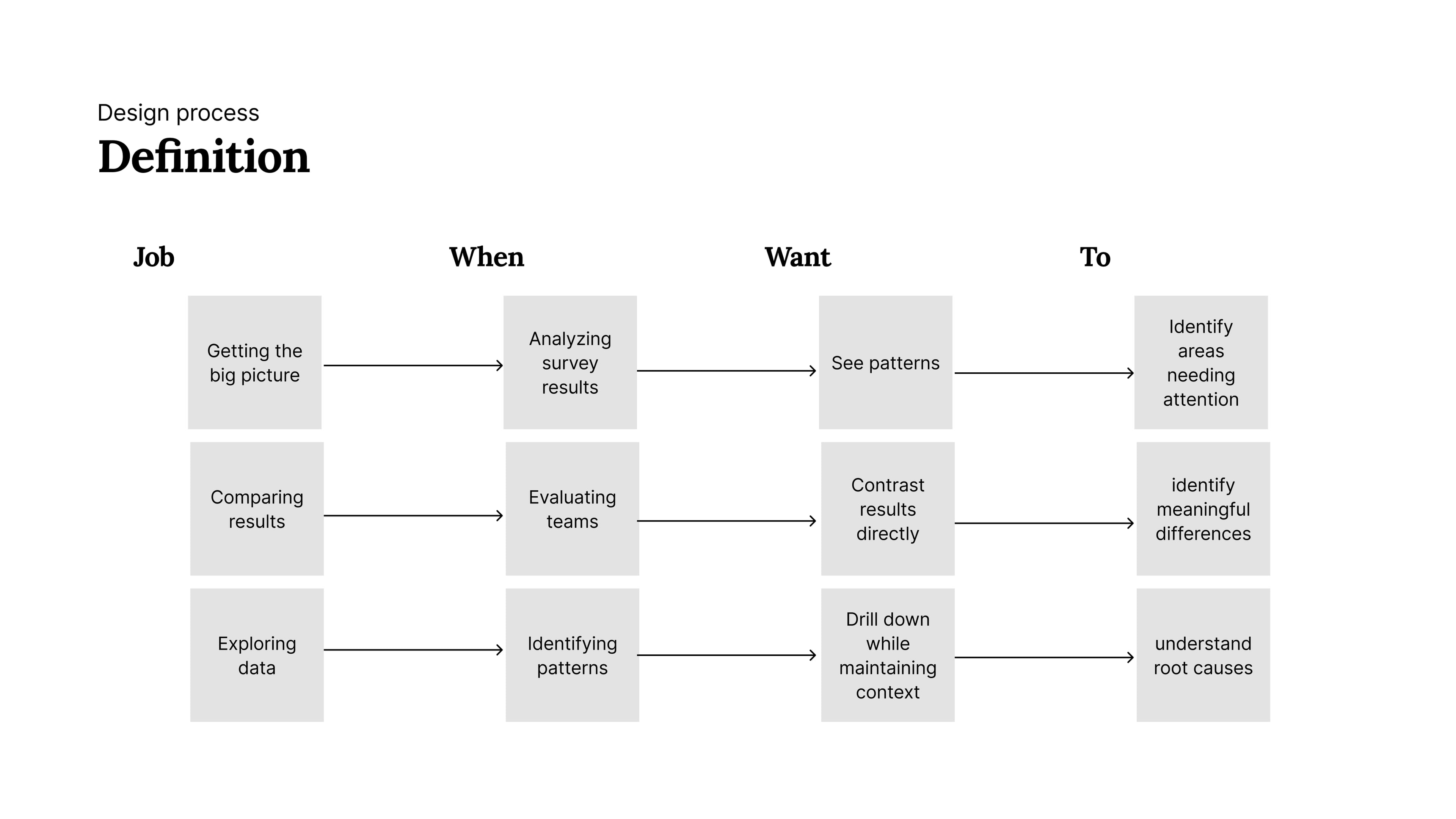
The analysis crystallized three core jobs-to-be-done, each representing a critical analysis phase:
Beyond Traditional Dashboards
Breaking from conventional dashboard thinking, we envisioned a system where visualization wasn't just about displaying data - it became the primary means of navigation. This led to key conceptual breakthroughs:
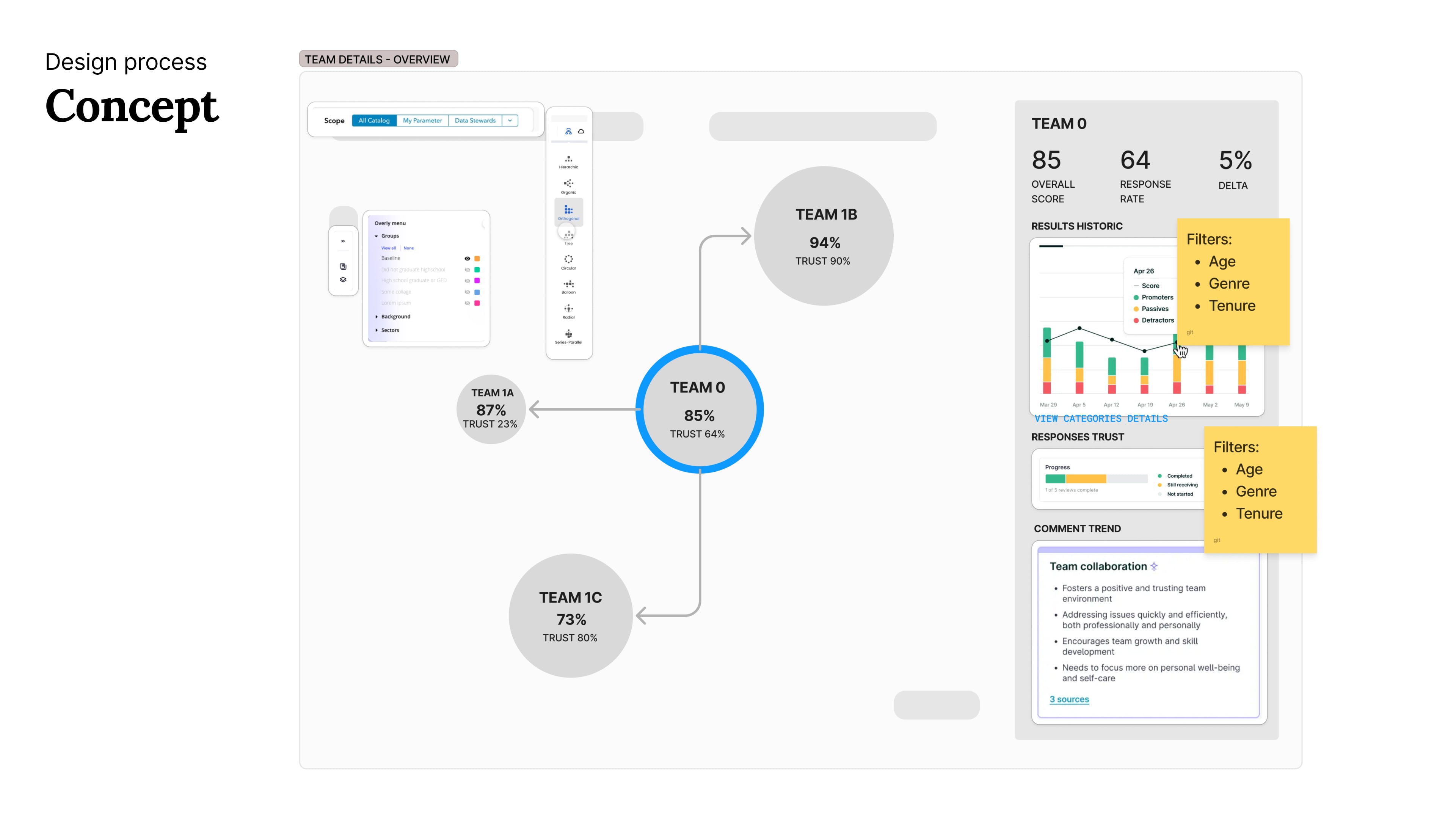
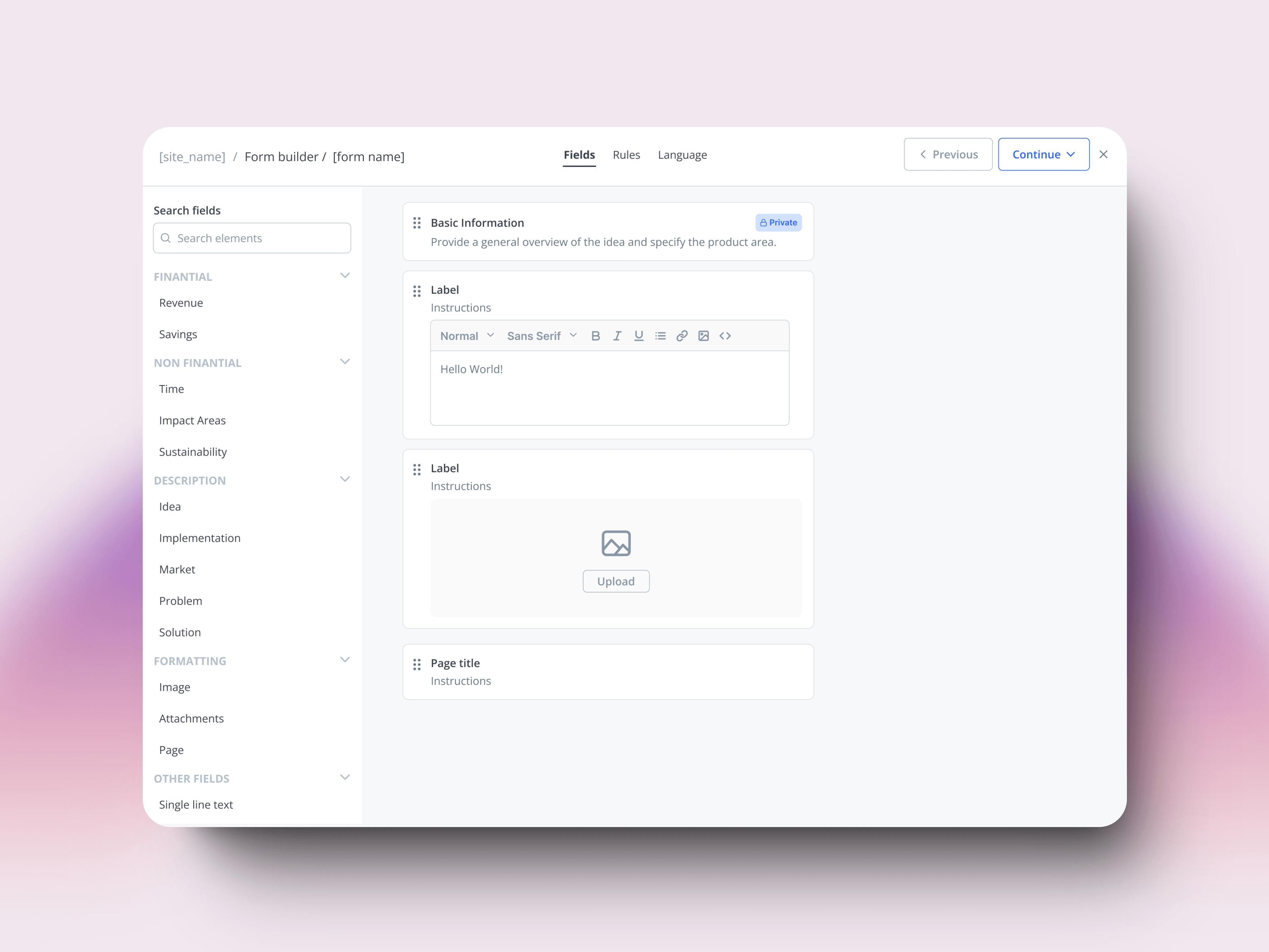
The graph visualization concept emerged from watching analysts map organizational relationships on whiteboards. We translated this natural behavior into a digital experience, using it as both navigation and data display.
The drawer system came from observing how analysts kept multiple windows open to maintain context - we integrated this need directly into the interface.
Making Data Dance
Our solution evolved into an interactive platform where:
A radial organization view provided immediate insight into team health
Contextual drilling enabled seamless navigation through organizational layers
Side-by-side comparisons emerged from real user sessions where analysts manually arranged windows
Historical trends integrated directly into team views, eliminating the need for separate tools
From Prototype to Reality
We're approaching a pivotal moment - our first release to the broader analyst team. After working closely with our core group of data analysts, we're ready to validate how the solution performs when users explore it independently. The radial visualization, team comparisons, and drill-down capabilities will face their first real-world test.
The upcoming launch focuses on three key aspects:
How analysts naturally navigate through organizational data without guidance
Whether the contextual information model supports their analytical process
If the visualization approach truly enhances pattern recognition across the organization
Next steps involve monitoring user adoption, gathering direct feedback, and identifying areas for refinement based on actual usage patterns.
For me, this project opened new possibilities in how we approach data exploration through design. Moving beyond traditional dashboards has shown promising ways to handle complex organizational data while maintaining user context and engagement.